The 5 Second Test For PPC Landing Pages
I’ve been having a lot of conversations recently about optimizing websites for lead generation and explaining a concept called the 5 second test. The 5 second test is a design usability test that aims to help usability testers evaluate and prove the effectiveness of user experiences designs. The idea is that you show someone a design for 5 seconds and then ask them a series of questions that evaluate the ability of the user to quickly and easily use a piece of software or a website. Although the test is typically used as more of a usability tool, it has extremely useful applications as a stress test for pay per click landing pages and lead generation optimized websites. I like to take a look at a landing page for 5 seconds and ask a few questions right off the bat.
- What is the offer?
- Is this offer applicable to me?
- How do I claim it?
When you’re spending $25+ a click for people to come to your website and landing pages, you want to make sure you’ve put together something pretty darn compelling to prevent them from insta-bouncing and you’ve got about 5 seconds to make it clear that you’ve got something compelling to say.
5 Second Tests For B2B Lead Generation
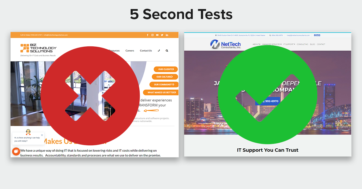
Just to illustrate my point, take a look at the home page of this Carolina based information technology company. Give the screenshot below a quick look for 5 seconds and try to answer the questions. What do they do? How can they help me? How can I contact them?

You might be able to answer these questions after a little bit more of an in-depth look, but is it easy? Does it jump out at you immediately?
Now do the same thing with the site below:

We know a few things almost immediately after landing on this page.
- They are an IT support company
- They are Jacksonville based and applicable to Jacksonville business
- I can contact them by clicking or dialing the phone number that’s highly visible in the center of the screen.
If I’m representing a Jacksonville based business searching for an IT company, I know nearly immediately that I’ve come to the right place and in many cases that’s enough to at least stop them from bouncing instantly and taking some more time to learn more about the company, and in a best case scenario it’s enough to generate a phone call without further hesitation.
This is a powerful tool, and while the design above may seem pretty simplistic, it’s effective at bringing in leads. Read more in this MSP Marketing Case Study.
Understanding Browsing Behaviors
A lot of business owners make the mistake of thinking about their website in it’s entirety, which is a big mistake. A great majority of journeys that result in a conversion will be between 1 and 3 pages and look like this.
Landing Page -> Conversion
Home Page -> Service Description Page -> Conversion
Blog Post -> Home Page -> Service Description Page -> Conversion
B2B conversions often come in two flavors:
- People who need emergency service and are looking for an acceptable provider in a hurry
- People who have gotten to know your company passively through seeing blog posts, engaging on social media, an a multi touch integrated marketing journey
In both cases the conversion journey often ends with an activating offer and a browsing session that consists of a single page visit. Because of this, you need to make sure your offer pages, service description pages, and other key pages have minimal friction, clear presentation of the key information, and clear relevance to the visitor. In other words, they need to pass the 5 second test.
People only care about what they specifically are looking for, so while your website may have dozens of different landing pages with various offers and ways to slice up and pitch what you sell, those will rarely be browsed or viewed holistically. Make sure those 1-3 pages that participate in a user’s conversion journey are optimized for the specific part of the overall conversion journey, give easy access to information needed, and allow for an easy way to convert when the visitor is ready.
Need help optimizing your landing pages or website for lead generation? Reach out and schedule a free consultation.