The PRESTO Landing Page Copywriting Framework

Creating a landing page that converts can be a challenge. There’s a lot that goes into it, but one of the most important aspects of that is the copywriting. It would be a significant challenge to create a landing page that converts that uses 0 copy and only design, but it would be much more straightforward to create one that is un-styled from a design perspective, but uses compelling copy. Copy is ultimately what sells and visual design and imagery is just a way to augment or reinforce what the copy is saying and create an emotional feeling to pair with the copy that increases urgency and the likelihood of converting.
What does good landing page copy look like though? I’ve thought about that question a lot of the past few years here running Tortoise and Hare Software and I’ve devised my own framework for creating effective landing pages that I’m going to share with you here today. I like to call it the PRESTO framework.
- Pain
- Resonate
- Educate
- Simplify
- Testify
- Offer
I’ve developed this framework through trial and error and thinking about how to systemize the creation of landing pages for a distributed team of marketers. I’ve built hundreds of landing pages, many of them are not great, but after observing the ones that do convert and experimenting with other copywriting frameworks like Awareness Interest Desire Action (AIDA), and Problem Agitate Solve (PAS), I’ve found they are too broad and too hard to follow. The PRESTO copywriting framework is much more specific, repeatable, and performs well in terms of driving conversions for longer form landing pages that you would typically find on a website such as service description pages, location pages, industry pages, pay per click landing pages, and seo landing pages.
The copywriting framework is not designed for more simplified landing pages such as Squeeze pages or lead capture pages.

The Elements Of The PRESTO Copywriting Framework
Again the PRESTO copywriting framework has a few key sections and is meant to walk people through a persuasive pitch for a product or service in a lead generation scenario. It’s meant to support the development of landing pages on websites that need to generate leads. Below are the elements of the PRESTO landing page copywriting framework.
PAIN
I’ve spent far too much of my time during my career trying to sell people on the potential for future gains, or a positive outcome. While it can work on some people, I’ve ultimately come to the conclusion that most people do not buy on potential. Aside from some venture capitalists and a subset of entrepreneurs, most people don’t think about investing in their future. If they did, we wouldn’t have such a severe problem of people getting to 65 with inadequately funded retirement accounts.
What do people buy on reliably, and predictably? One almighty unforgettable word:
Pain
I bet just reading it sitting out there in isolation made it hurt a little. People buy to get rid of pain. Marketers and sales people hang out on social media platforms espousing the importance of being proactive with their marketing near daily, but that largely falls on deaf ears. People don’t really invest in marketing until they are forced to, either by a churn events from their customers that cause a business contraction, the fear of impending retirement, a desire to sell their company in the coming years, or some form of problem.
This is why Google paid search ads and SEO have always been such a huge driver of success for both our own agency and the clients that we serve. There’s rarely a better time to reach people than when they are searching for solutions to their problems.
How does that translate to landing page copy? Well the first thing you want to do is establish what the pain point is, ideally with your headline or subtitle, above the fold, and within the first 5 seconds of the visitor landing on the page. You’ve go to hook them almost immediately after landing by demonstrating that you are going to talk to them about their pain.
Show them that you understand their motivations as soon as they land.
If the landing page your building isn’t tied to a specific pain point, then you could alternatively think of this as PURPOSE. Address their purpose.
Resonate
After you’ve established that you’re talking to them about the pain point you’re trying to solve for them it’s time to bring in that element of storytelling that marketers always rave about. It’s not enough to say “we build websites”, or “we have CRM software”, or “we fight legal battles on your behalf”. If you really want to pull someone in to your landing page and have them seriously consider your offer you’ve got to tell them a little bit of a story. Let them know that you understand their pain because of your experiences in working with clients or have experienced the pain yourself. We’re trying to build some rapport with your website visitors and tell them your brand story, all while telling them a story that resonates with their pain. It’s a lot to fit in to a paragraph or two, but copywriting is a skill like any other.
A secondary goal here is to agitate the visitor a little bit. We want them to remember how annoying their pain is in an emotional way. If you can use a few data points or awareness statistics to back up claims and start to build rapport with some secondary sources to establish trust, even better. Once we’ve got them a little worked up and remembering how annoying their pain point really is, it’s time to move on to the next part of the copywriting journey.
Educate
This is by far the most fluid of the copywriting sections and when I build a PRESTO landing page. I almost always circle back to the education section last. I think it’s helpful to build the introductory portions of the page first (Pain, Resonate) and the concluding elements afterwards (Simplify, Testify, Offer). This helps to make sure you’re maintaining consistency of your message from the start to finish of the pitch. Once you have that clarity established I also find it’s a lot more straightforward and there’s a lot less writer’s block when creating the EDUCATE section.
The main takeaways of the educate section should be what do they need to know to understand their problems better, and what do you do to solve that problem for them. They should have a clear understanding of what do I get if I choose to engage with you?
How you present that information if up for interpretation.
I often find myself including a couple of elements in an education section over and over again, but this section again is again very fluid an depending on the context of the page you are building. When creating copy for a landing page it’s often important to understand how that copy could be presented. A couple of presentation options are:
Left Right Left Blocks
The first of these are what I like to call left right left blocks. The concept is pretty simple. Copy will be presented in alternating 2 column blocks and paired with imagery that supports the copy. This is usually good to support educational components that need to be a bit more wordy.

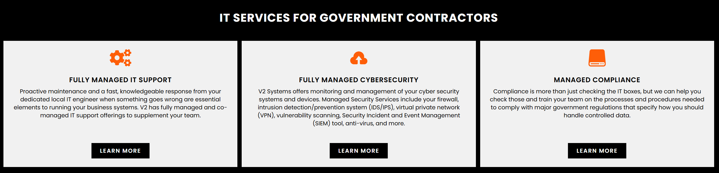
Card Blocks
Card blocks are another popular formatting option for more slightly more wordy or medium length bits of copy. They are often navigational and help people get to additional related sections of a website. They are usually presented as a 3-card block as shown below.
Icon Blocks
Similar to card blocks. Icon blocks usually contain smaller more digestible bits of information. These are usually good for breaking down sub-components of a service offering or key product features.
Pricing Tables
Depending on the context, pricing tables or comparison tables even without pricing can be a powerful way to help visitors understand what the heck it is you can do for them and what their options are.

Frequently Asked Questions
I love to include a frequently asked questions section at the very end of the EDUCATE section right before going into simplify. Usually this is supporting information for the overall educational message.

Simplify
By the time a visitor has combed through the EDUCATE section, which may be a bit more mechanical they are in a different information consuming state. Before we ask them to fill out a form we need to reset their psychology and put them into a more emotionally driven state. Enter the function of the simplify section.
The simplify section should be a highly visual, bold colored, and action oriented section that consumes a lot of real estate on a landing page. We are going to challenge the visitor a little bit and tell them what to do.
We are going to include a secondary CTA to start putting them back into that action oriented mode. The simplify section should also be able to tie back pretty closely to the PAIN section and original pain point. Again we want to stay focused and be consistent with our messaging throughout the landing page.
I find this section to be one of the most important and one that I frequently have to ask writers to go back and take 3,4,5 cuts at to try and get right. People want to be too passive here but we want to lean into the principle that people don’t act unless challenged so we want to challenge them in this section.

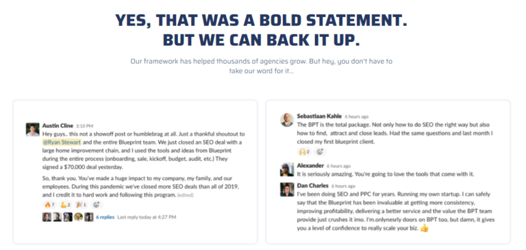
Testify
Once we’ve challenged them a little bit in the simplify section it’s time to reinforce that acting upon that challenge would be a good decision with some social proof. The testify section’s core component should be to include testimonials for social proof but this section can also be expanded on to incorporate other trust building elements such as partner logos and case studies.

Offer
The last section of the PRESTO framework is the OFFER. This is one portion of landing pages that I frequently see botched. Too many companies just put a generic contact us and a form or call now and a phone number at the bottom of their landing pages. Even if you take that same old contact form or phone number as the primary CTA, you need to frame it as an offer. E.G. call now for a free consultation. Or talk to a solutions advisor about your needs.
Even better a content upsell that you can present for them to download, also known as a lead magnet. People can always scroll back up to the top of your landing page and hit the contact button or keep scrolling down on into the footer of a website and contact you there if they want to. Don’t be afraid to put a more lead magnet oriented offer as your primary offer on landing pages. Not every landing page needs to result in a bottom of funnel conversion such as a call or a form submission. Capturing an email address for ongoing lead nurture is still valuable.

Wrapping Up The PRESTO Landing Page Copywriting Framework
The PRESTO framework is a great way to think about how to write the copy for your landing pages. It takes people through a process of creating a miniature bond with your offer and then presenting it to them at the right time when they have been “warmed up”. As with many things, writing effective copy takes practice, but following a copywriting framework such as PRESTO, AIDA, or PAS can be a great way to put some structure and process into the creation of landing page copy. This framework was developed creating hundreds of landing pages for Tortoise and Hare Software and our clients over the years and has helped generate thousands of conversions on landing pages. Copywriting is just one element of a landing page though, design, the offer, targeting, and many other factors go into the success of creating an effective one. Give the PRESTO copywriting framework a try on your own landing pages, let us know how it goes for you in the comments below. If the PRESTO framework isn’t getting you everything you need, feel free to reach out and request a review of your marketing funnel and landing pages.